Dispensary Admin Platform
Redesigning feature discoverability for complex multi-location retail operations
The Platform
Jane Technologies is a cannabis e-commerce company connecting dispensaries, brands, and shoppers. Jane's Admin platform is the operational backbone for dispensary operators — the surface where they configure stores, manage inventory, build menus, run specials, set pickup and delivery rules, and manage staff permissions.
It's a large, feature-rich B2B ecosystem. And it was showing its seams.
I joined as Lead Product Designer and owned end-to-end redesign of the Admin platform — from initial research through final design — while simultaneously running field research at cannabis dispensaries to ground every decision in real operational constraints.
How might we help retailers manage, grow, and scale their online business?
The Scope
The Admin covered everything a dispensary operator needed to run their online business:
- Store settings — hours, checkout flows, notifications, integrations, pickup and delivery options
- Product management — catalog, editing, multi-store application
- Menu customization — collections, smart suggestions, custom styling
- Specials — configuration, tracking, and performance insights
- User and permission management — role-based access across locations
For a multi-location operator, managing all of this across 10 or 20 stores simultaneously was the expectation — not the edge case.
The Problem
The existing Admin had a discoverability crisis. Dispensary operators — ranging from solo store owners to regional managers overseeing chains of 20+ locations — needed to move quickly between tasks: audit products, set up specials, manage menus, configure pickup settings. But the navigation structure didn't reflect how they worked. Features were buried. Related settings lived in unrelated sections. There was no way to quickly switch between stores.
One finding from user interviews crystallized the problem: users weren't overwhelmed by the number of buttons — they were overwhelmed by the number of features hidden inside buttons. The platform had the functionality. Users just couldn't find it.
Before redesign — Cluttered interface, no visual hierarchy, and features buried where operators couldn't find them. Store status wasn't visible at a glance.
Two main challenges shaped the scope:
How do we create a navigation structure that makes sense to users while improving feature discoverability?
What are dispensaries' top use cases — and how do we design for them without exploding scope?
Research
Stakeholder Workshop
I started by facilitating a stakeholder workshop using the How Might We (HMW) framework with the product and engineering team. Through an affinity diagram exercise, we collaboratively surfaced the key challenge: Information Architecture — feature discoverability and navigation structure — was the highest-leverage area to address.
This alignment mattered. The Admin platform had many problems. Getting the team to agree on which one to solve first meant we could scope the project with confidence rather than trying to fix everything at once.
HMW exercise
HMW make our features discoverable?
Card Sorting
To understand how users actually categorized the platform's features — not how the engineering team had organized them — I ran both open and closed card sorting exercises with 20 participants, ranging from internal partners to external small and large dispensaries.
The results revealed real misalignments between the current IA and mental models users brought to the platform. I used these findings to build a revised sitemap, then validated it with users before any design work began.
All cards
User Interviews
I conducted 10+ interviews spanning multi-state operators (MSOs) to small independent stores across multiple states. The research surfaced consistent patterns across store sizes:
Busy Budtenders
highly task-driven
High turnover and fast-paced environments mean budtenders are focused on putting out fires and handling day-to-day operations with efficiency.
Store Managers
smooth operations
Responsible for ensuring smooth operations — creating announcements, managing inventory, and tracking sales to keep the store running effectively.
Regional & Corporate Managers
consistency across locations
Focused on maintaining brand consistency — overseeing logos, specials, and menu customizations across all stores.
- Auditing products is one of the top reasons operators sign into Admin — checking for missing menu items, editing for compliance, or building specials
- Multi-location operators needed cross-store management: set up stores, edit products, create specials across all locations simultaneously
- Users needed to jump quickly between tasks — after auditing products, they're immediately ready to build a special or update a menu
- Operators want direct links between stores and settings, not multi-step navigation
The Framework
User Insight
“Features are deeply interconnected in their workflows — after auditing products, operators are immediately ready to build a special or update a menu.”
How might we enable efficient access to multiple features without disrupting their flow?
Design Pattern
Quick Access to Features
Horizontal Feature Tabs
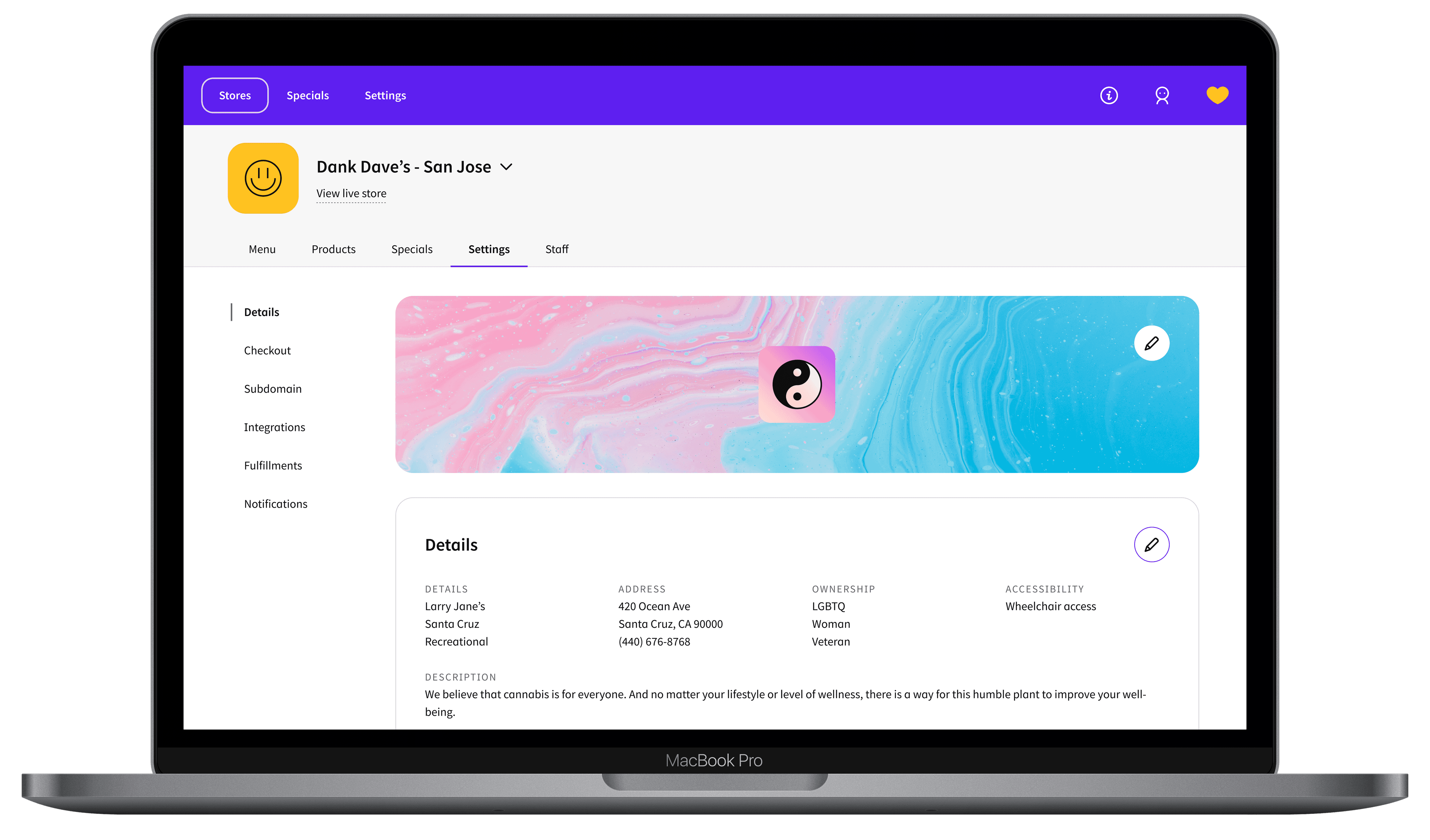
A top-level tab bar mapping to the platform's major feature areas, allowing operators to jump between feature sets with a single click.
Vertical Context Nav
A persistent left sidebar anchoring users within each feature area. Horizontal tabs tell you where you are at the feature level; vertical nav tells you where you are within it.
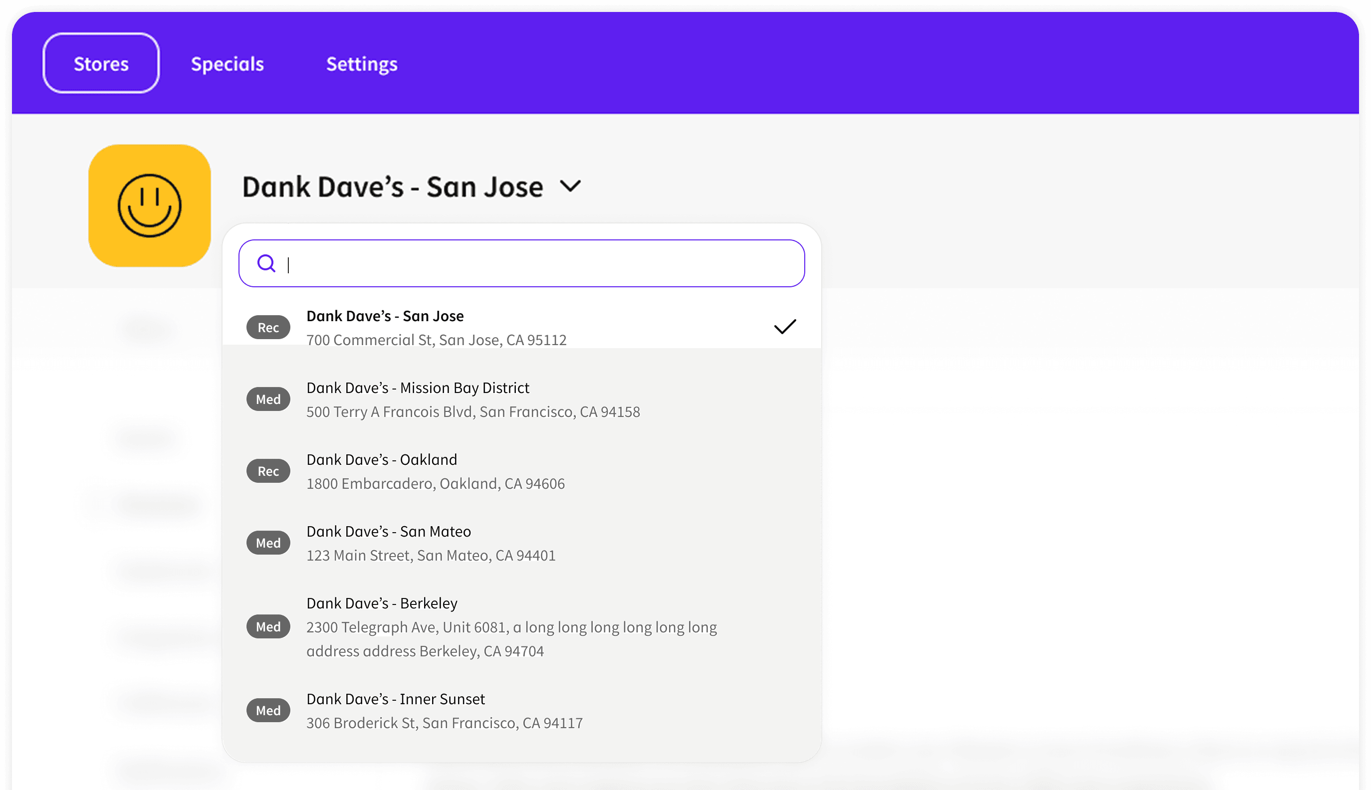
Store Switcher
A persistent dropdown letting operators switch between stores instantly from anywhere — eliminating the highest-friction pain point for multi-location users.
User Insight
“Most users are casual — budtenders with high turnover who need to act fast. Only a few are power users who need access to all information upfront.”
How can we design the interaction pattern to avoid overwhelming casual users while still serving power users?
Design Pattern
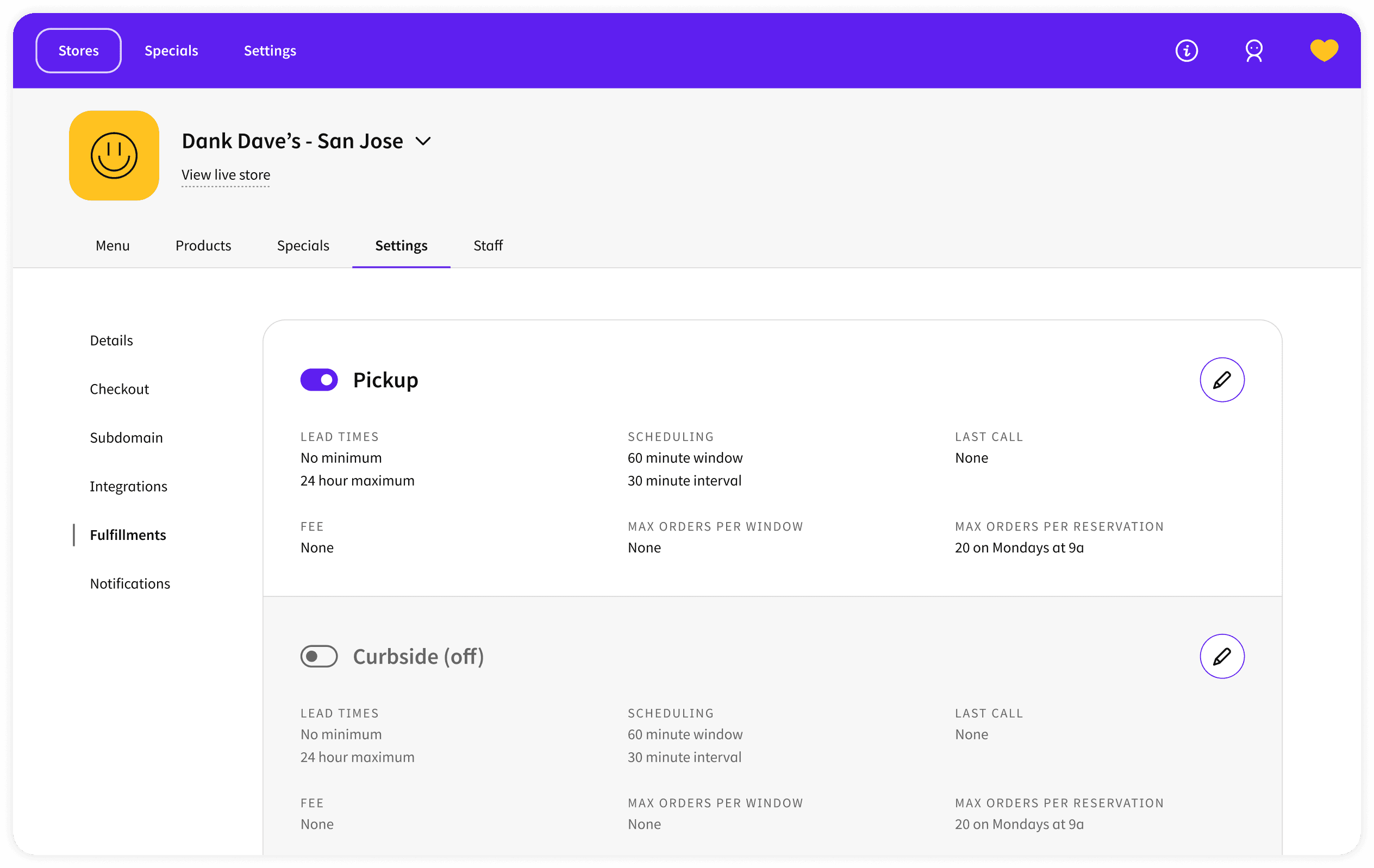
Progressive Disclosure — View / Edit Framework
Read-only state Default for all settings
Allows operators to scan and compare data without risk of accidental edits — particularly important in compliance-sensitive contexts.
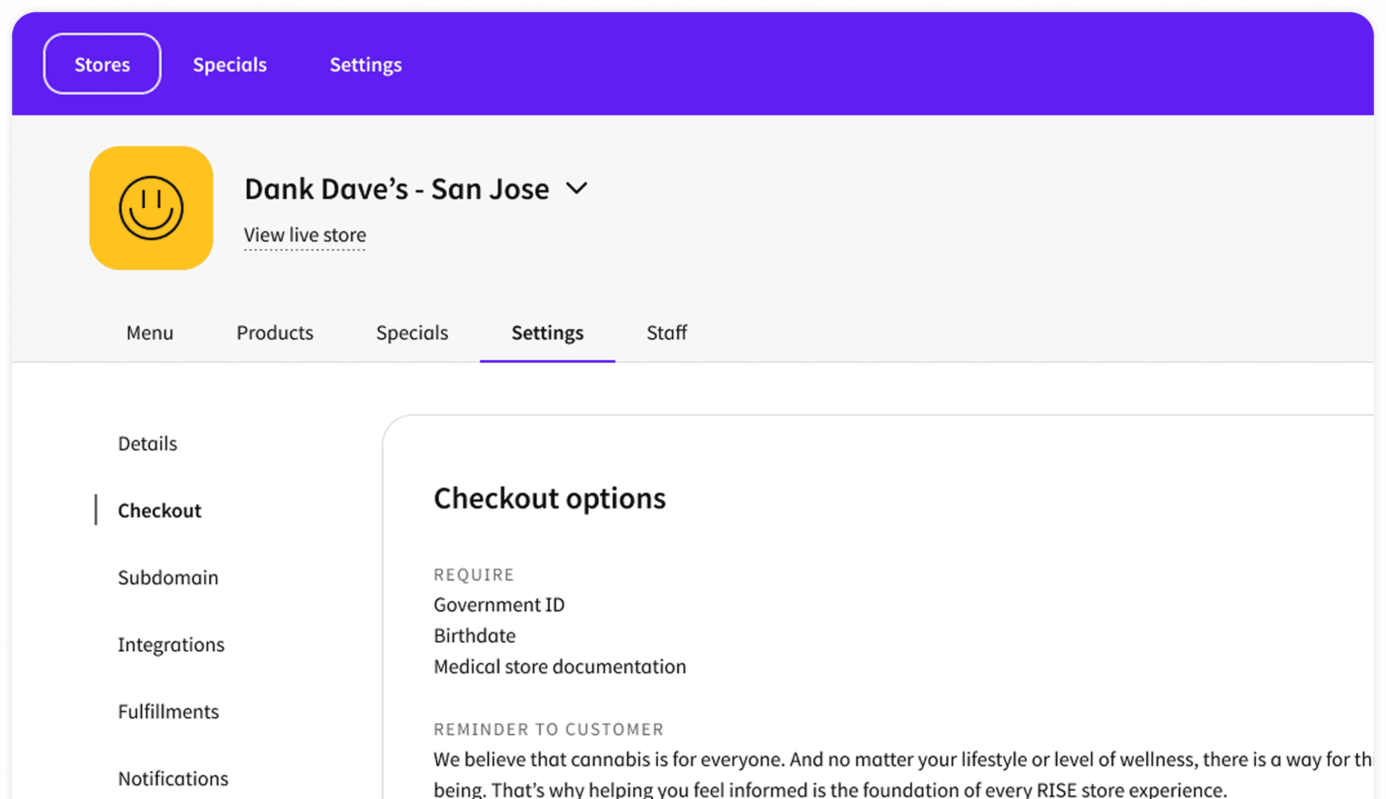
Modal edit Single-field or focused changes
Keeps the operator anchored in context with one focused edit before returning to the overview. Reduces cognitive overhead for simple changes.
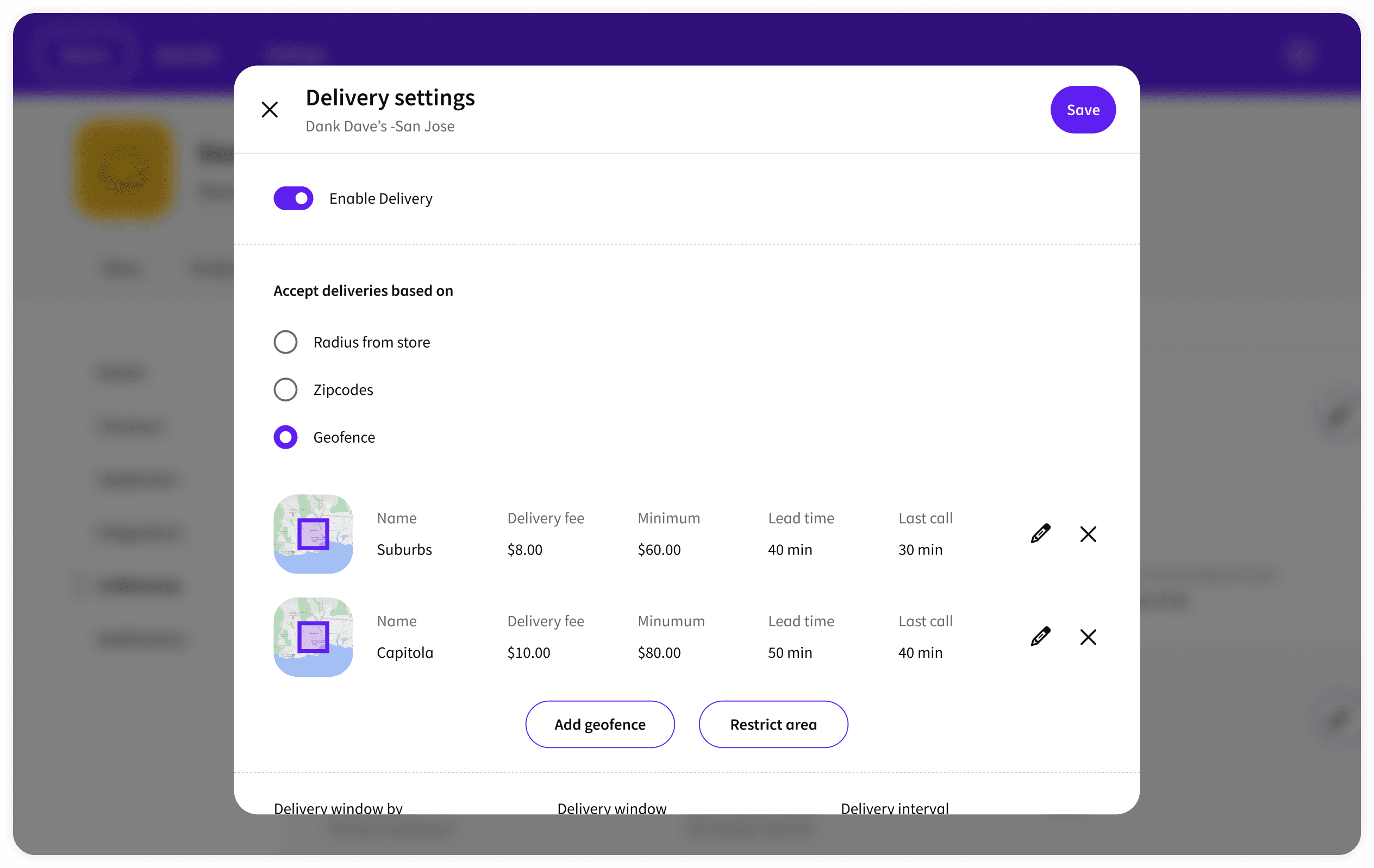
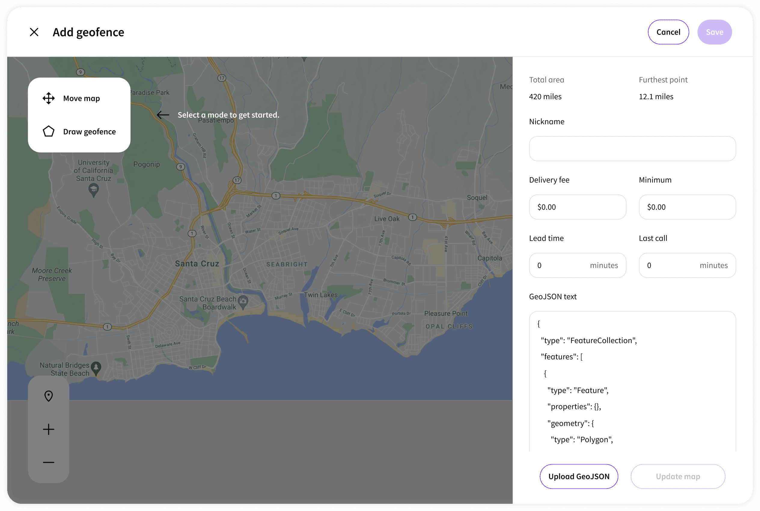
Full-page edit Complex configurations
Some settings — like building a menu collection or configuring a special — require enough space to think. Full-page edit gives operators room to work.
User Insight
“Store managers need to edit their store's settings and understand why certain configurations apply. Regional managers need a bird's-eye view across all stores.”
How do we design an interaction pattern that allows store-specific editing without losing the global view?
Design Pattern
Store-level vs Global-level
A dual-layer navigation architecture — store-context views for editing individual store settings in depth, and a global management layer for cross-store operations like bulk product edits, chain-wide specials, and brand configuration. The Store Switcher lets any user move between these contexts fluidly without losing their place within either layer.
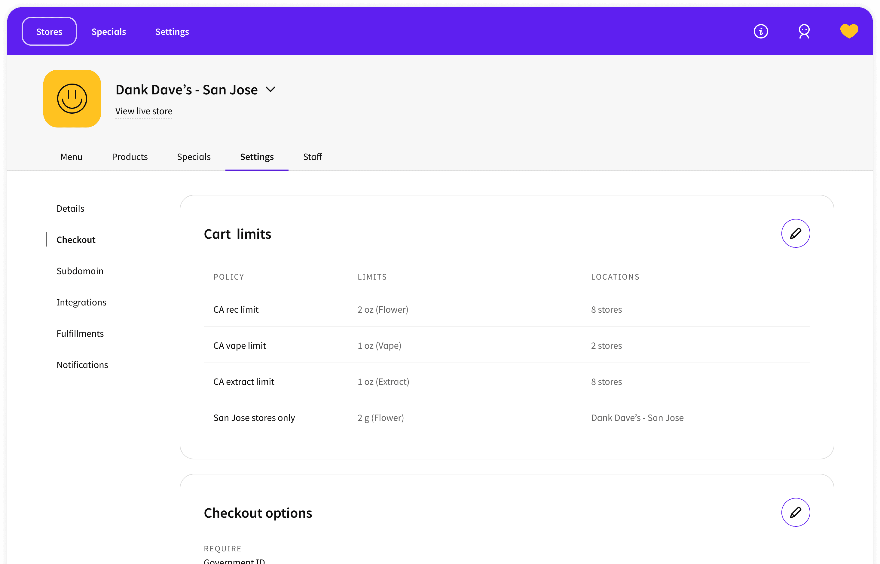
Store view — each setting shows which global policy it inherits, so managers always know where a configuration comes from. Global policies can be edited directly from within the store context.
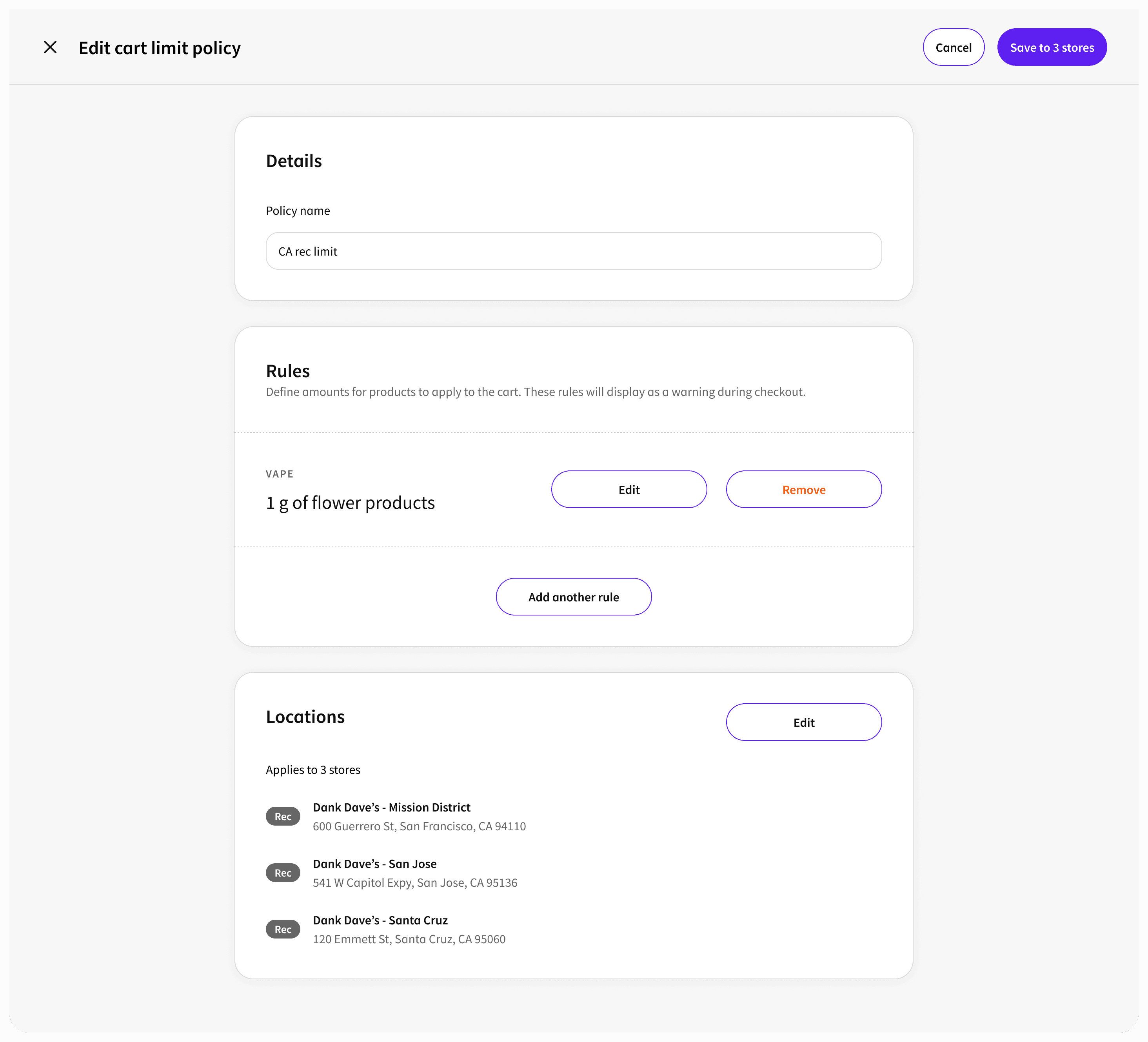
Global view — when editing a shared policy, managers assign it to individual stores from a single surface. Multi-location updates happen in one place.
Field Research as a Design Input
Cannabis retail has operational constraints that don't show up in interviews. I conducted regular field research at dispensaries throughout the Jane engagement — visiting stores, observing budtenders and store managers working the platform in real conditions, and understanding how the digital Admin connected to physical in-store workflows.
This fieldwork shaped how I designed curbside and in-store pickup features — particularly during COVID, when demand spiked and curbside pickup accounted for over 50% of total sales at peak. The design couldn't be built from a desk. The operational reality at the store level was too specific and too fast-moving.
Outcome
GMV growth
13×
Within one year of redesign
Checkout
+111%
Conversion rate increase
Team built
1 → 6
Designers on the team at departure
Reviews
500K+
Product reviews on the platform
Building the Design Function
In parallel with the product work, I established UX research as a core disciplineat Jane — running discovery research that surfaced 20+ pain points that fed directly into product strategy. By the time I left, the design function had grown from 1 to 6 designers. I was offered the opportunity to lead the UX research discipline.
The Admin redesign wasn't just a design project — it was the work that demonstrated what design-driven product thinking could do for a fast-moving startup, and built the case for investing in design at Jane.