Creating a Social Phenomenon in HealthTech
Making genetic probability data legible for non-scientific users
Context
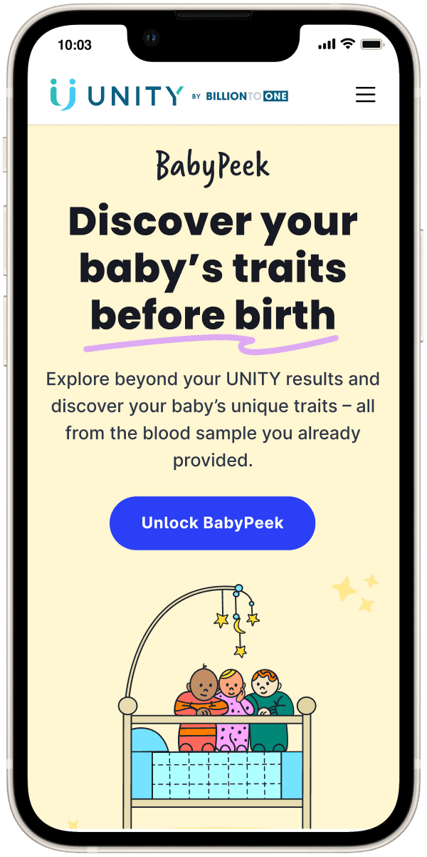
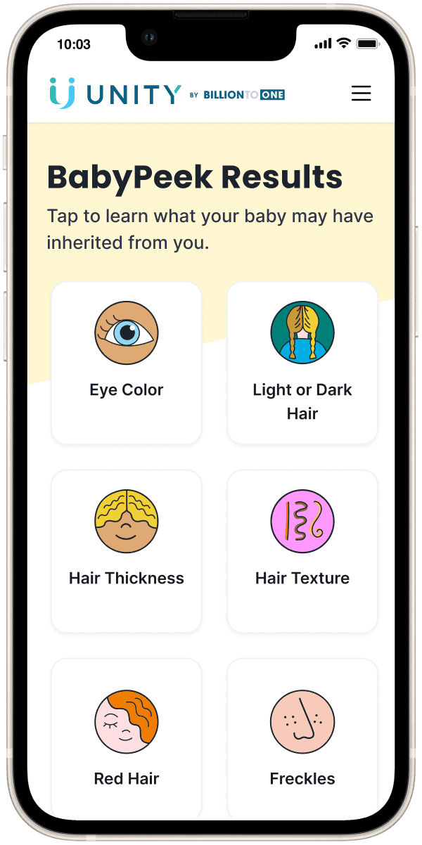
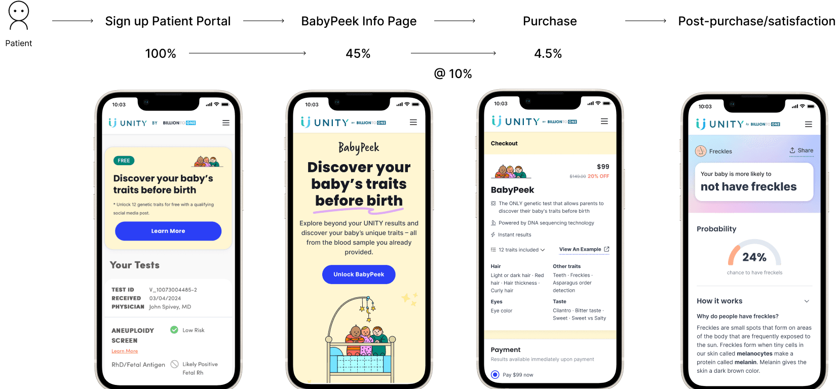
BabyPeek is a consumer add-on to UNITY, BillionToOne's prenatal genetic screening test. UNITY screens for serious chromosomal conditions. BabyPeek lets expectant parents discover lighter traits from the same blood draw — eye color, hair color, cilantro aversion — before birth.
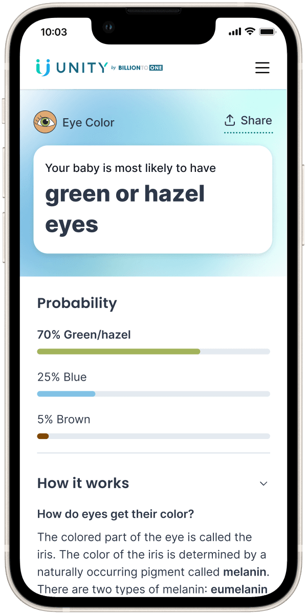
The product sits at an unusual intersection: a consumer experience built on top of a clinical test. Results are genetic probability predictions, not certainties. That distinction isn't just a legal disclaimer — it's a core design constraint. Every part of the experience had to communicate “this is our best guess” without making non-scientific users feel like they're doing statistics homework.
I led design and product management of BabyPeek end-to-end, from 0 to 1.
How might we create the social phenomena of BabyPeek?
Success Metrics
#babypeek posts on social media
Comments on social media
Number of shares
Satisfaction rating
Research
Before designing anything, I needed to understand who was buying BabyPeek and why. I combined quantitative and qualitative methods.
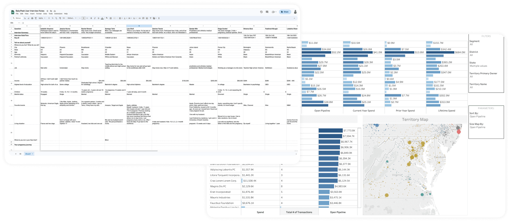
Data Analysis
I analyzed key demographic and behavioral factors influencing BabyPeek purchasing decisions — age, ethnicity, insurance type, marital status, and location — using spreadsheets and Tableau. This surfaced which user segments were more or less likely to purchase, giving us a targeting model to inform product and campaign design.
User Interviews
I interviewed 20 participants who had interacted with BabyPeek in the past week — understanding motivations, emotions, and behaviors, not just funnel drop-off.
Personas
From the research, I developed six user personas representing the diversity of expectant parents who might interact with BabyPeek. I shared these with stakeholders before any feature work began — aligning VP of Product, VP of Marketing, and Engineering Lead on who we were designing for. The personas became the foundation for every brainstorm that followed.
Adventurist
User Flow, Brainstorming & Feature Prioritization
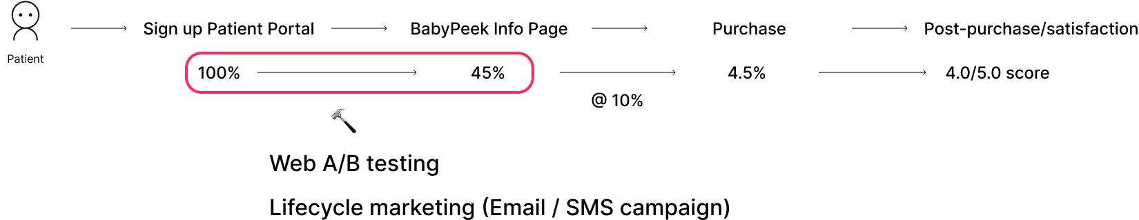
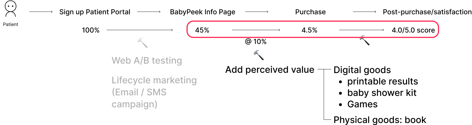
With research in hand, I led a collaborative brainstorming session with the cross-functional team to identify opportunities. I analyzed the existing user flow alongside conversion numbers at each step — identifying where users dropped off and what drove the most engagement. Tracking this alignment was crucial for designing a product that met user needs and achieved business goals.
Three Hypotheses
Info page traffic
“If more people visit the info page, the likelihood of purchase will increase, driving broader adoption of BabyPeek.”
Perceived value
“If we enhance the perceived value of BabyPeek, more people will make a purchase and experience greater satisfaction with the product.”
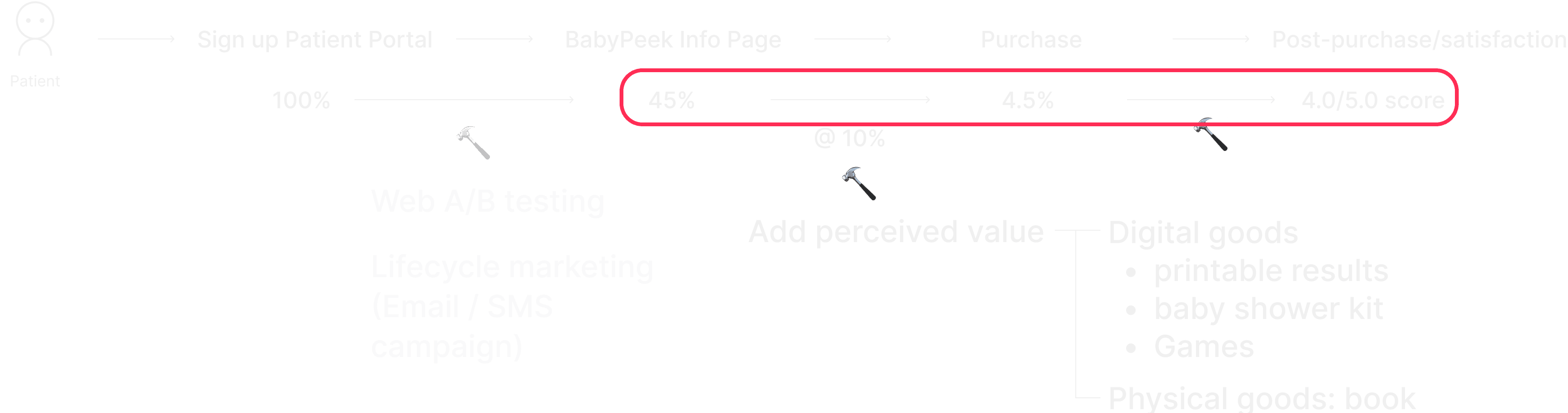
Price reduction
“If we lower the price of BabyPeek, more people will purchase it, leading to higher satisfaction ratings with the product.”
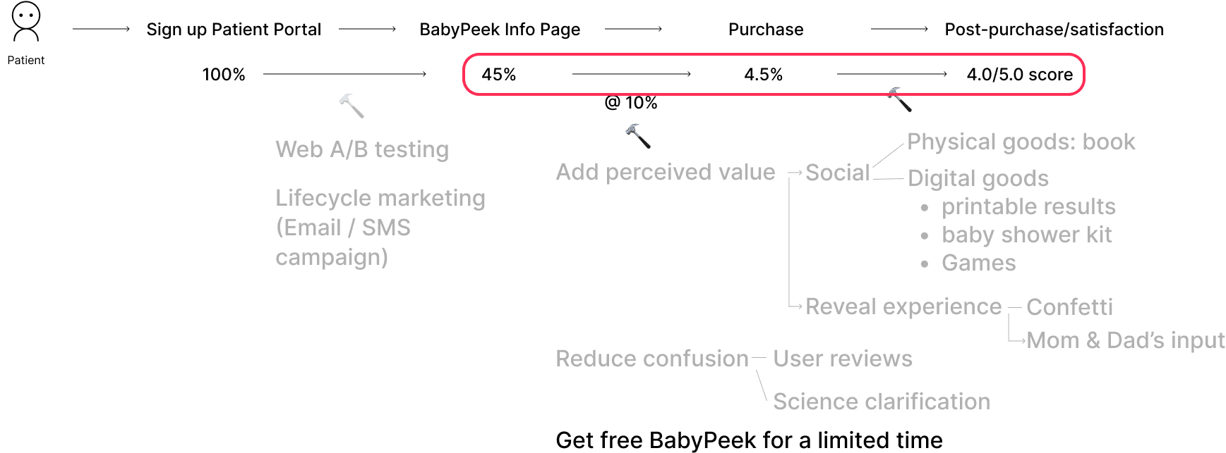
Feature Prioritization
We assessed each potential feature against level of effort, impact, and risk — creating an actionable roadmap that prioritized the highest-value features first without overextending the team.
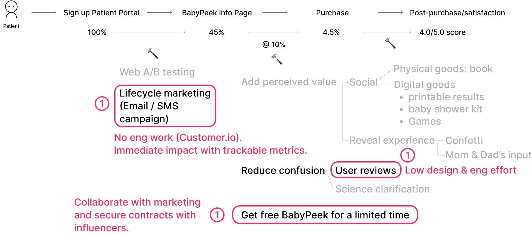
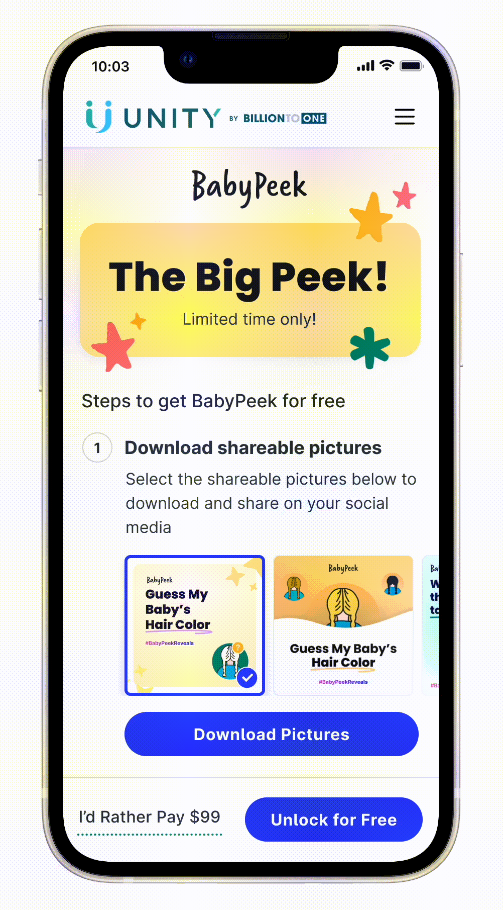
Design: "Get Free BabyPeek for a Limited Time"
Hypothesis 3 led to the most interesting design problem. We wanted to reduce the barrier to purchase, but we couldn't offer BabyPeek for free — doing so would create legal issues around inducement in a clinical context.
The solution: users could unlock BabyPeek for free by sharing it on social media. This created a viral loop — every share was both a distribution channel and organic social proof. But research showed many users would need help with the sharing step. I designed two assets:
- Sample sharing images — pre-made visuals users could post directly
- Step-by-step guide — a clear walkthrough of how to share and apply the promo code
User Testing Insights
After the initial campaign design, I ran user testing to validate the flow before launch.
Friction identified
Users were not sure what to write when sharing
Confusion on how to receive and apply the promo code
Verification step was below the fold
Too many steps in the flow
Some users were not ready to share their pregnancy news publicly
What was working
Users understood what was being asked of them
The verification step felt legitimate and trustworthy
BabyPeek Walkthrough
Based on user and stakeholder feedback, I refined and iterated the design — simplifying the sharing flow, surfacing verification above the fold, reducing steps, and adding pre-written copy options so users had a starting point without requiring them to announce their pregnancy publicly.
Results
Social posts
2,000+
#babypeek on social media
Campaign shares
4,000+
In a single 5-day campaign
Satisfaction
4.8/5
User satisfaction rating
Conversion
+75%
Overall conversion rate increase
What I Took Away
Personas aren't just deliverables
Building six personas before any design work forced every idea in the brainstorm to answer for a real person. When someone proposed a feature, the first question became “which persona does this serve?” — not “does this sound good?”
Legal constraints produce better design problems
The inducement restriction that prevented us from offering BabyPeek for free turned out to be a design gift. It forced a mechanism that was simultaneously legal, viral, and user-respecting — and the social sharing unlock was a better solution than “just make it free” would have been.
Creating a social phenomenon requires owning every touchpoint
The campaign visuals, the sharing copy, the post-share confirmation — all of it had to be coherent for the phenomenon to happen. I held the thread across design, product, and lifecycle marketing to make sure it did.
Conversion data is a research tool
Tracking where users dropped off in the flow — and treating those drop-off points as design questions — shaped how we iterated. Every percentage point was a signal about something the experience wasn't communicating clearly enough.